The SMSA Express logo and branding project was a significant undertaking for a Saudi-based logistics company that was previously operating under the FedEx identity. As the art director, my role was to develop a visual identity that would allow the company to stand on its own while communicating its unique values and mission.To develop the new logo, we started by exploring a variety of concepts and visual elements that could effectively communicate the company's values of innovation, reliability, and excellence. We ultimately decided to combine the location drop pin with a parachute to create a unique and memorable logo mark that reflects the company's core business of logistics and transportation.The location drop pin represents the company's commitment to delivering packages and goods to the right location, while the parachute symbolizes speed, efficiency, and innovation in the delivery process. We chose the color orange for the logo mark to represent enthusiasm, creativity, and energy, and to help the logo stand out in a crowded market.
SMSA Express
Parachuting into the Spotlight: Reinventing SMSA Express
ALL PROJECTS

Jahez App
Creative Campaign

Mabani
Logo Design & Visual Identity

Almarai Juices
Creative Campaign & TVC

Fullscript
Creative Campaign

Cream & Crumbs
Logo Design & Packaging

Zain Telecom
Miscellaneous Creative Campaigns

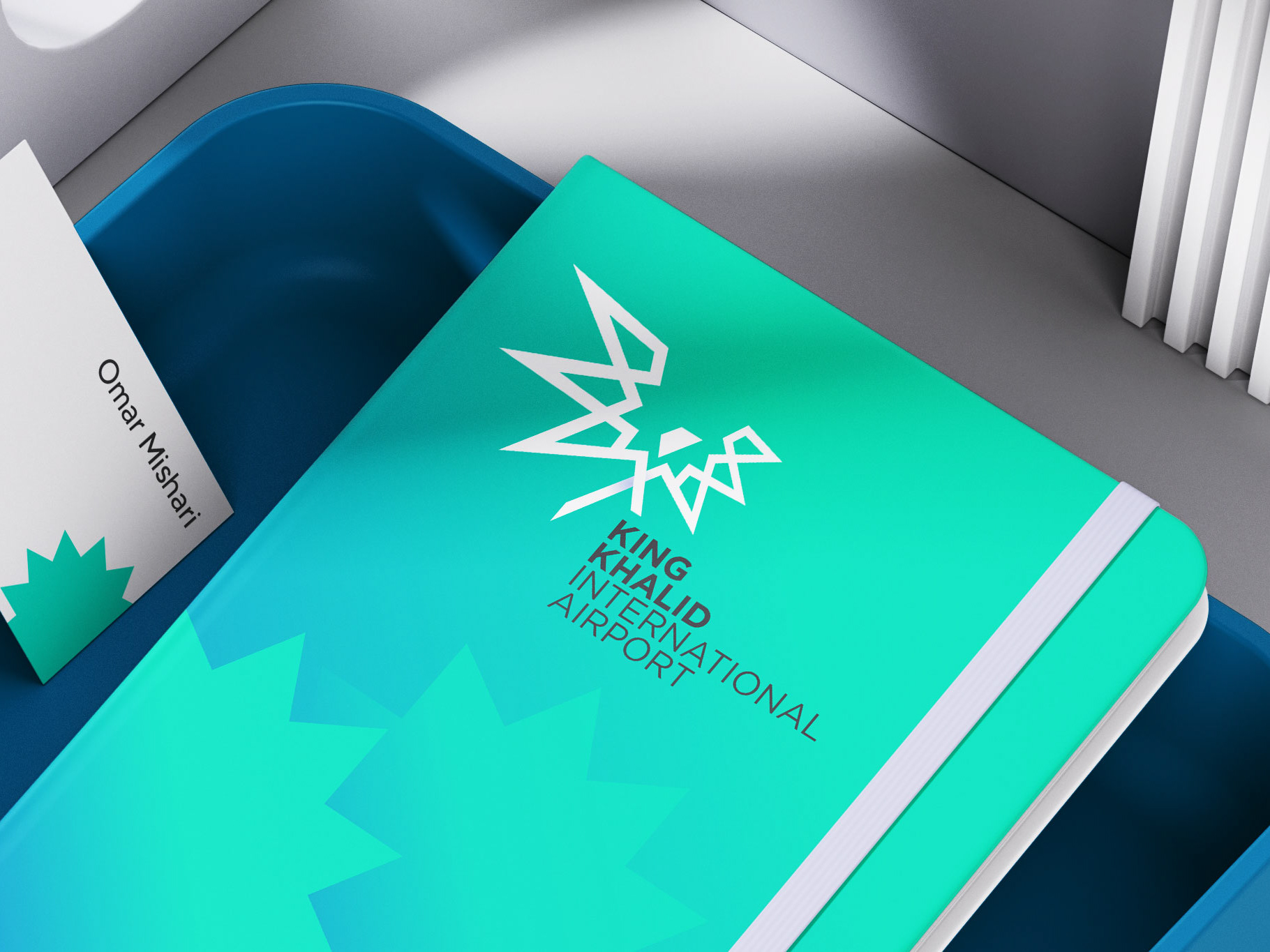
King Khalid International Airport
Logo Design & Visual Identity

Kaneka Nutrients
Web Design

OLX Marketplace
UI Design
